Bubblegum Zombie Hunter
Kaylee's Sprite improvements/redesign
MORNING COFFEE DESIGN TALK.
Morning everyone I've got my coffee and i'm going to chat about what changes are being made to Kaylee's sprite.
The sprites currently all fit into a 32x32 square canvas (with the exception of the larger boss zombies who are 64x64), and that decision was made to keep everything cute and squishy. However, Kaylee's sprite was one of the first things that was made, and it was initially made before the promo art and everything else... 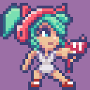
we find that the sprite doesn't really fit the promo art and the direction we are taking so we've decided to begin updating her. 
She is now 37 pixels tall and uses a 48x48 canvas to allow us to do bigger animations and give her more breathing room.
This is a big task and it also means the zombies will be getting the same treatment. She's still small and cute, but that extra height and room has allowed for so much more.
Another big change is the frame count, her original sprite had 4 frames for running, this redesign (still a work in progress) uses 9. as you can imagine that's a lot more work as her movement is 8 directions. However we felt it was important as we know that players are going to be spending a lot of time with Kaylee across her adventure, so getting this right is very important to us.
She's come along way, and i'm very happy with the new direction.
(left to right - Place holder original Kaylee > Old 32x32 Kaylee > NEW 48x48 Kaylee)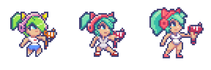
Comments
Log in with itch.io to leave a comment.
Awesome! Thanks for sharing the process, the end result is great, but I kinda like the placeholder's look a lot too ^_^
From my perspective I've stared at the placeholder in early builds of the game and to me it feels very old and no where near what we want it to look like... but aside from a small video a long time ago this is the first time I've posted it somewhere public. So to a new set of eyes I can see why it might look fine. maybe we'll put the placeholder in the game somewhere as an easter egg .
That makes total sense, thanks! I do see the placeholder is unpolished, but the aesthetics are more appealing to me, specifically, the bigger eyes, smaller legs and fringe shape I like better on the 1st version, as well as the color saturation.
I'm not saying the latest version isn't the better one or that it should be changed in any way! That is definitely the better choice for the game, great work :)